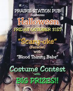
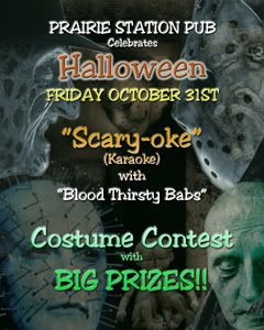
I thought I'd share my new Halloween posters. I won't even tell you how long it took me. They are a labor of love.
 Which do you all like better?
| Karaoke Scene's Karaoke Forums https://mail.karaokescenemagazine.net/forums/ |
|
| Halloween posters https://mail.karaokescenemagazine.net/forums/viewtopic.php?f=1&t=14789 |
Page 1 of 1 |
| Author: | Babs [ Wed Oct 15, 2008 11:53 am ] |
| Post subject: | Halloween posters |
I thought I'd share my new Halloween posters. I won't even tell you how long it took me. They are a labor of love. Which do you all like better?
|
|
| Author: | Babs [ Wed Oct 15, 2008 12:15 pm ] |
| Post subject: | Re: Halloween posters |
woops temporarily lost my pics. Sorry about that. |
|
| Author: | Karen K [ Wed Oct 15, 2008 12:18 pm ] |
| Post subject: | Re: Halloween posters |
Second one is a little easier to read but I LOVE the face on the first one - I'd use both! Fabulous job, ghoulie. |
|
| Author: | Lone Wolf [ Wed Oct 15, 2008 12:30 pm ] |
| Post subject: | Re: Halloween posters |
I'm with Karen on this one Babs. I like em both you really did a good job and I'm glad it was only your pictures that you lost and nothing else Lone Wolf |
|
| Author: | MorganLeFey [ Wed Oct 15, 2008 12:33 pm ] |
| Post subject: | Re: Halloween posters |
you are ghoulishly great Babs xx |
|
| Author: | Lonman [ Wed Oct 15, 2008 12:39 pm ] |
| Post subject: | Re: Halloween posters |
2nd one for reading I agree. |
|
| Author: | Babs [ Wed Oct 15, 2008 12:47 pm ] |
| Post subject: | Re: Halloween posters |
I'm so glad I asked. I prefer the 1st one, but I think you guys are right. The 2nd one is easier to read. I spent way to much time on the 2nd one, so at least that wasn't in vane. |
|
| Author: | PirateMike [ Wed Oct 15, 2008 5:10 pm ] |
| Post subject: | Re: Halloween posters |
Just tweak the background pic from the first one, and use that. Take down the contrast and raise the brighness. It will give it a nice eerie vibe. You can also wash out the hue so it's all one color like the 2nd one, then use oposite colors for your type. Problem solved! |
|
| Author: | knightshow [ Thu Oct 16, 2008 6:32 am ] |
| Post subject: | Re: Halloween posters |
excellent job "Bloodthirsty Babs!" |
|
| Author: | Alex [ Thu Oct 16, 2008 7:48 am ] |
| Post subject: | Re: Halloween posters |
I second that! Great job! |
|
| Author: | jamkaraoke [ Thu Oct 16, 2008 8:31 am ] |
| Post subject: | Re: Halloween posters |
Agree -GREAT JOB |
|
| Author: | bonehead [ Thu Oct 16, 2008 8:41 am ] |
| Post subject: | Re: Halloween posters |
i like the first one, but my wife says i have no taste for things.. very nice work on both! randy |
|
| Author: | Babs [ Thu Oct 16, 2008 8:55 am ] |
| Post subject: | Re: Halloween posters |
PirateMike @ Wed Oct 15, 2008 7:10 pm wrote: Just tweak the background pic from the first one, and use that. Take down the contrast and raise the brighness. It will give it a nice eerie vibe. You can also wash out the hue so it's all one color like the 2nd one, then use oposite colors for your type. Problem solved!
I did a bit of tweaking like you said and the first one was much more readable. I hung a few last night in the bar. In the lighter lit parts of the bar like the bathroom, they look great ! In darker parts of the bar you can read them, but you can't see the backgrounds very well. I knew not to go so dark, but it looked so cool. |
|
| Author: | PirateMike [ Fri Oct 17, 2008 3:40 pm ] |
| Post subject: | Re: Halloween posters |
Babs @ Thu Oct 16, 2008 8:55 am wrote: PirateMike @ Wed Oct 15, 2008 7:10 pm wrote: Just tweak the background pic from the first one, and use that. Take down the contrast and raise the brighness. It will give it a nice eerie vibe. You can also wash out the hue so it's all one color like the 2nd one, then use oposite colors for your type. Problem solved! I did a bit of tweaking like you said and the first one was much more readable. I hung a few last night in the bar. In the lighter lit parts of the bar like the bathroom, they look great ! In darker parts of the bar you can read them, but you can't see the backgrounds very well. I knew not to go so dark, but it looked so cool. That's a tough one. The venue that I work at has a lot of blacklights, so even where its dark, I know what colors will glow. You might try tweaking the contrast a bit just for those areas, and try adding different types of shadows on the words (light shadows and dark). I'd bring in one copy of a couple different versions as a test before you make a bunch of copies. Hope this helps! |
|
| Author: | OperaKitty [ Fri Oct 17, 2008 5:33 pm ] |
| Post subject: | Re: Halloween posters |
I like the first one.... |
|
| Author: | Murray C [ Wed Oct 29, 2008 10:49 pm ] |
| Post subject: | Re: Halloween posters |
Both are great Babs... Now, if you could just morph the faces of Palin and McCain into the second one, that'd be REALLY scary! 
|
|
| Author: | lordairgtar [ Thu Oct 30, 2008 3:20 pm ] |
| Post subject: | Re: Halloween posters |
Murrlyn @ Wed Oct 29, 2008 10:49 pm wrote: Both are great Babs... Now, if you could just morph the faces of Palin and McCain into the second one, that'd be REALLY scary! 
|
|
| Page 1 of 1 | All times are UTC - 8 hours |
| Powered by phpBB® Forum Software © phpBB Group https://www.phpbb.com/ |
|